spoon museum
The Spoon Museum in Vladimir is a private museum with 37,000 spoons from 165 countries. It positions itself as a historical one. The task was to rethink its visual language and reach a new audience: people aged 20–35, the creative class.
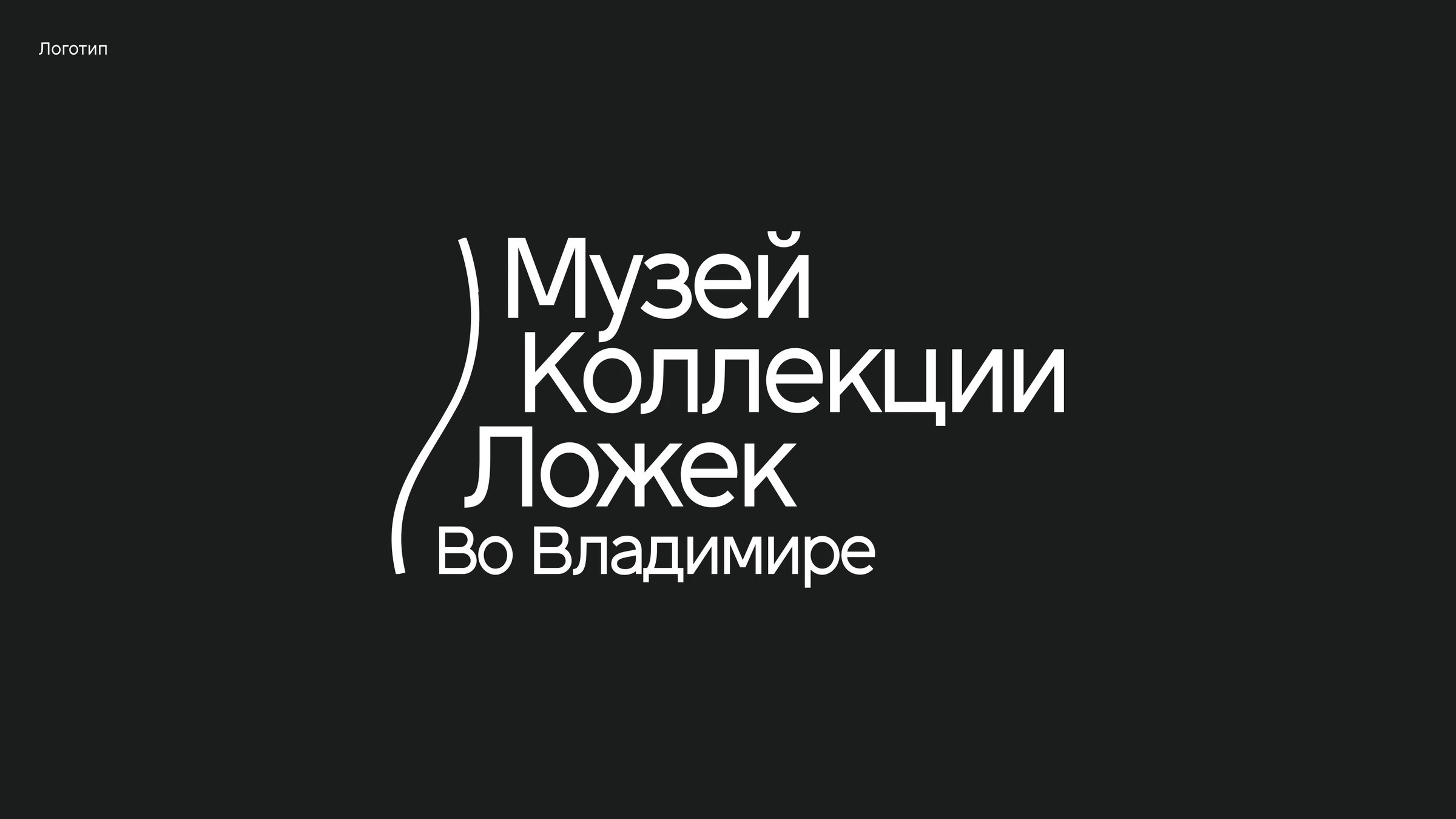
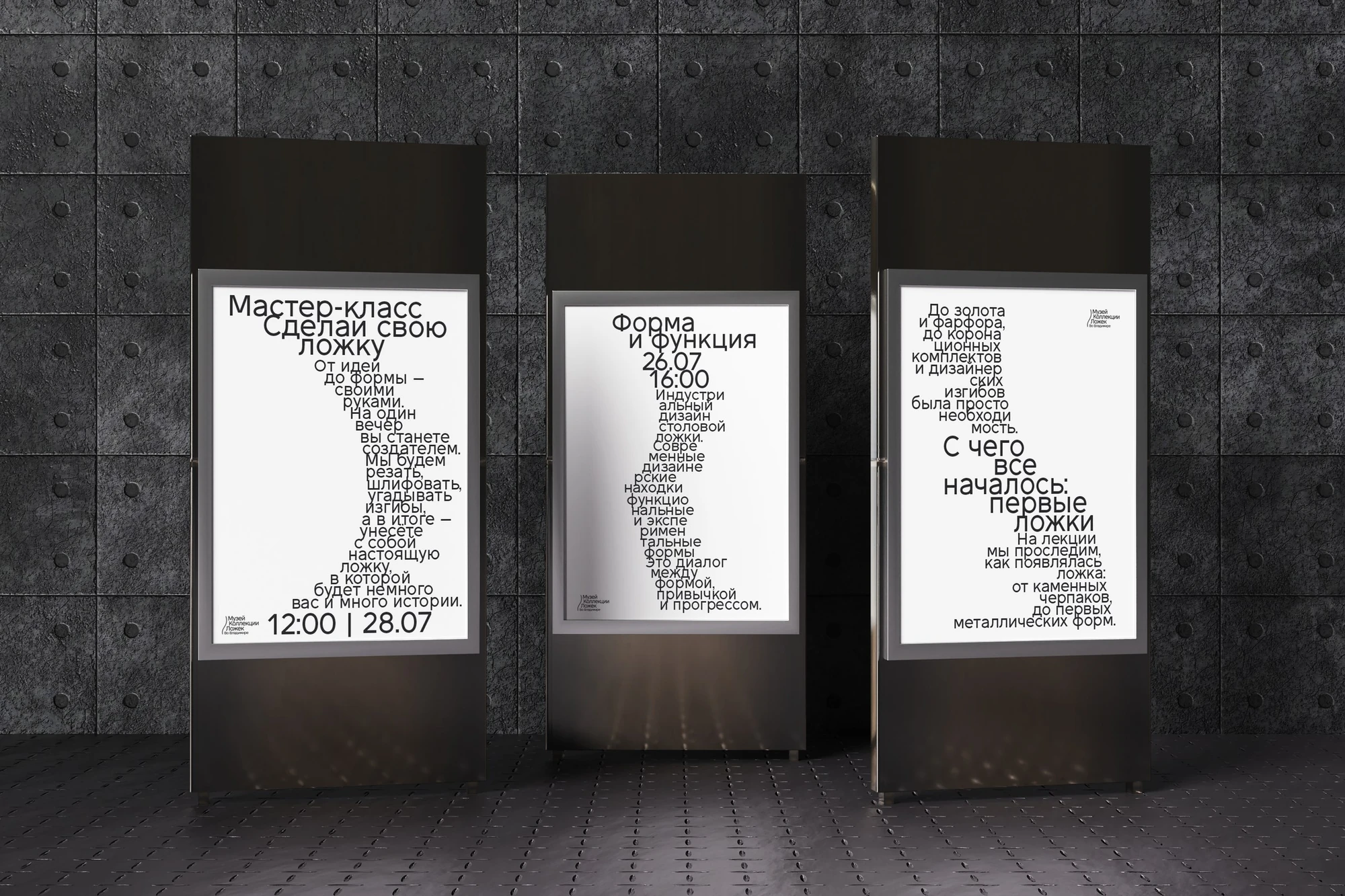
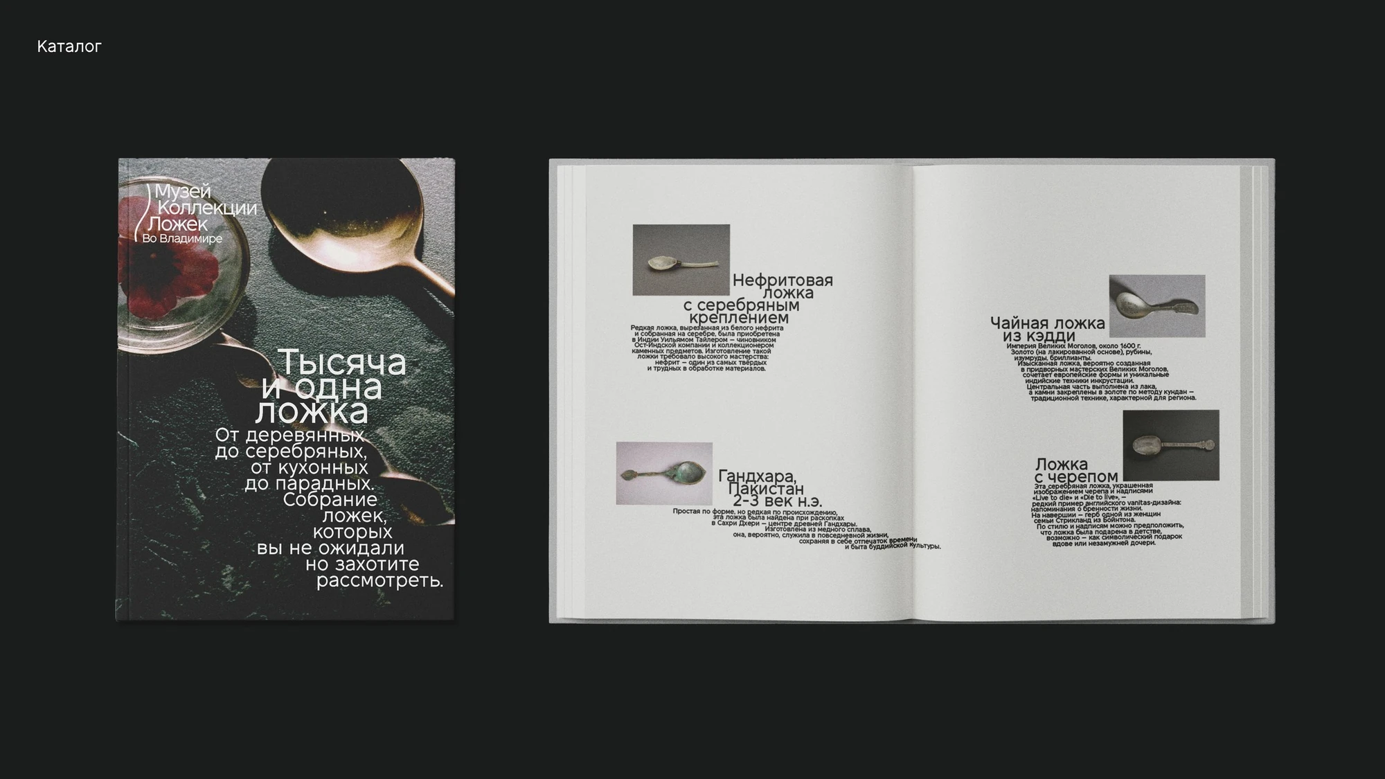
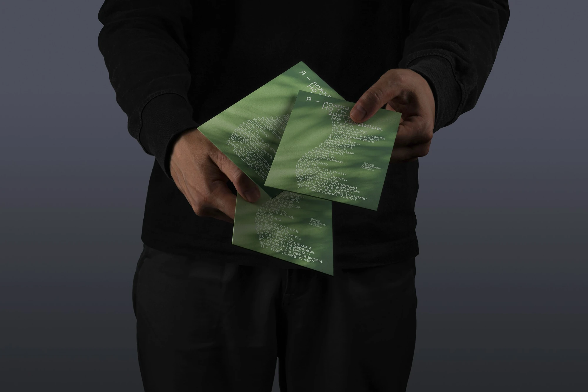
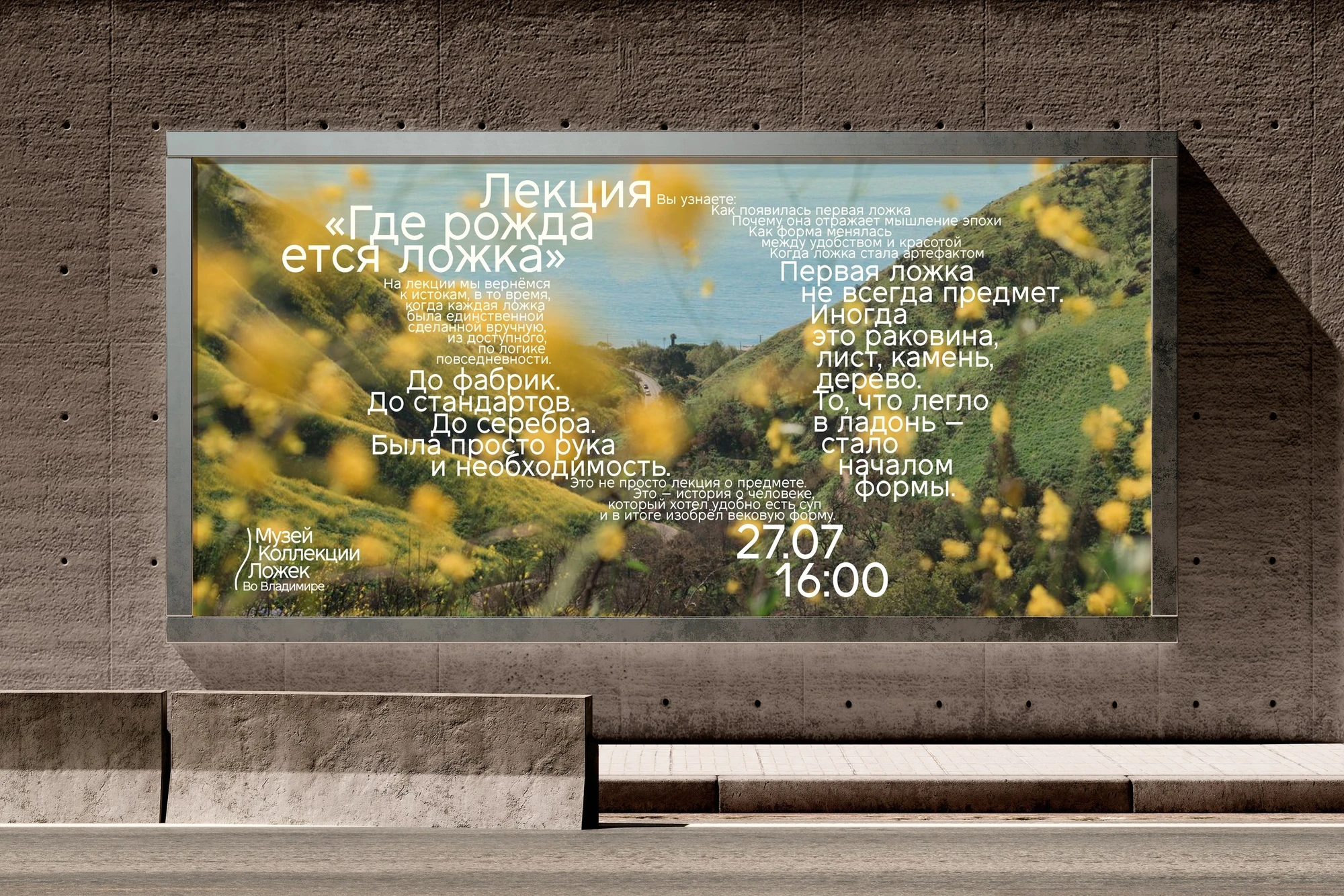
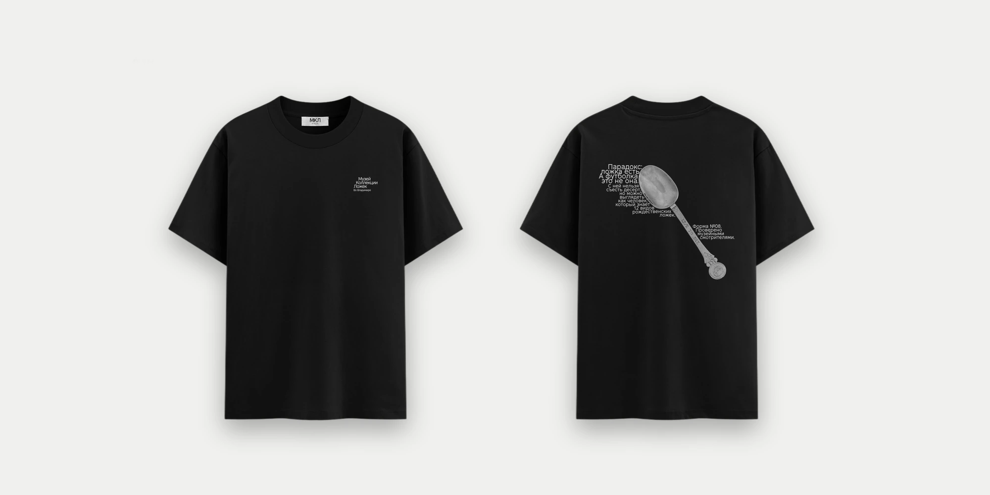
I wanted to see the museum differently: not as a chronology of artefacts, but as a collection of shapes and materials. And since it’s all about the shapes of spoons, I made shape the main principle: I don’t draw a spoon directly, I build everything around it. The eye completes the outline on its own, and at some point recognises the spoon.
Subkultur brings a relaxed mood and a touch of rebellion: it breaks the rules but stays readable.
Typeface: Subkultur Regular
(Vasilisa Aristarkhova, Bolditalic, 2024).
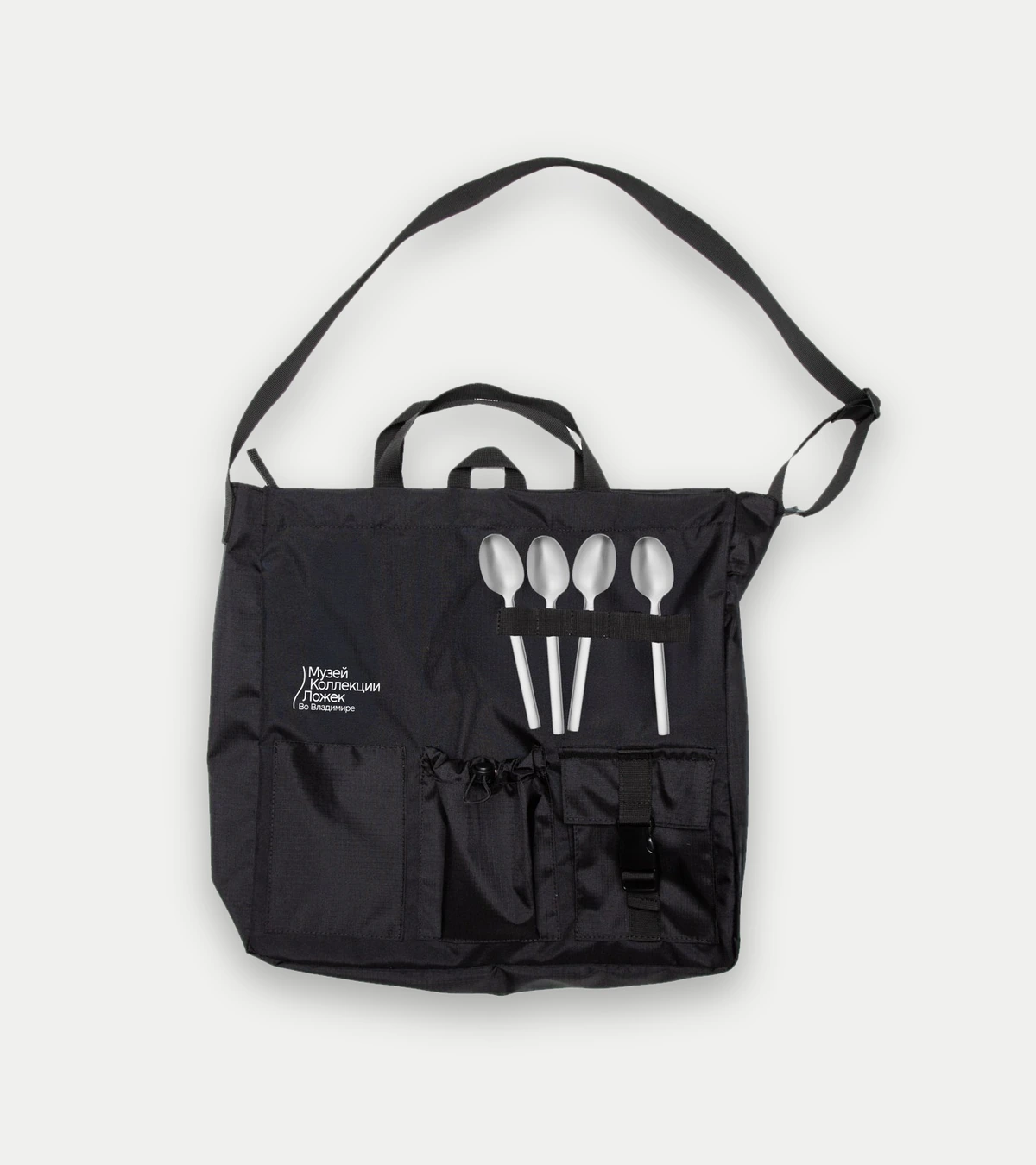
Built into the silhouette. It doesn’t pull attention to itself and works as a neutral signature to the collection, so the shape can speak for itself.
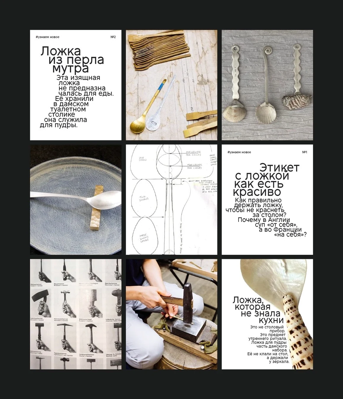
They’re deliberately not readable at first glance: that’s the stop signal. You recognise the shape, read on, linger. In the advertising ones it’s the other way round: the text sits inside the silhouette, with photos of the collection around it.